PINDER Digital Menu
Create or get matched with your “pizza of destiny”!
Role: UI designer
Project Summary
Key features overview
Design process... is a lot like making a pizza!
Shaping features
Flow building
Wireframing
Choose toppings
Design system
Accessibility
Decision making
Bake the pizza
Hi-fi screens
Prototyping
Documentation
Shaping features
What kind of user experience are we providing?
How might we gain value for both the customers and the restaurant?
Aligned UI design
Trust-building features
Restaurant & staff story
Ingredient producer story
Nutritional value
Highly interactive features
Create your own pizza
Pizza flavor matching with AI
Flow building
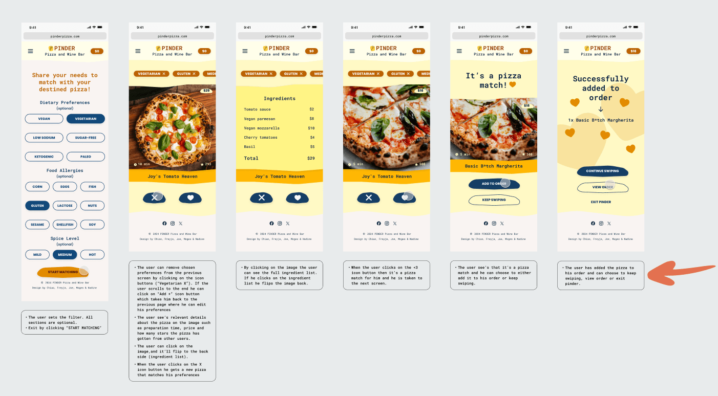
Main user flow: place an order
Wireframing
Main user flow: create a pizza and place a dine-in order
Good design system makes it easy for everyone.
Color
The primary color: Selective Yellow (#FFB703)
cheerful, vibrant and fun
good contrast and liveliness via high saturation
The accent color: Cello (#133A5F)
classy vibe
nicknamed “hipster blue” by the team
The background color: Fantasy (#F9F4F2)
playfulness
a mild flirty tone
Typography
Roboto mono (Headline & subtitle) and Poppins (Body & label) for good readability
Line height
For larger types: 1.2 times the type size
For smaller types: 1.5 times the type size
Components
Variants & variables
Reflection: how did it taste?
Challenges & learnings
Challenge 1: Making collaborative design decisions
Providing objective context when raising proposals, instead of turning to personal taste as reasoning, helps to build a healthy conversation.
Being able to kill one’s darlings, stay open-minded for discussion & iteration, is the key to keep the team progress on track and produce high-quality result.
Challenge 2: Building a collaborative design system
To ensure an efficient workflow, set up a clear file structure with consistent naming conventions and a well-defined hierarchy (page-section-layer-components) to organize work.
Staying vigilant about potential human errors and implementing good practices, such as locking frames after completion, can help avoid unwanted accidents.
What I’d do differently
Speed up wireframing.
It’s for internal communication, and doesn’t need to be perfect.
Test more rounds.
This helps to pick out mindless mistakes and refine prototype.
Have a developer as consultant.
This helps to confirm design feasibility and file format.
Add a real-time pizza creation simulation.
This gives users a clear idea of the final product.
Supervisor feedback
“Great work! This is a very good design. One thing I’m missing is more images (photos) which I commonly expect on a restaurant website, but the typography, layouts, and animations are very well done.”
- Mehmet Aydın Baytaş | Instructor | industry leader | hyper island


